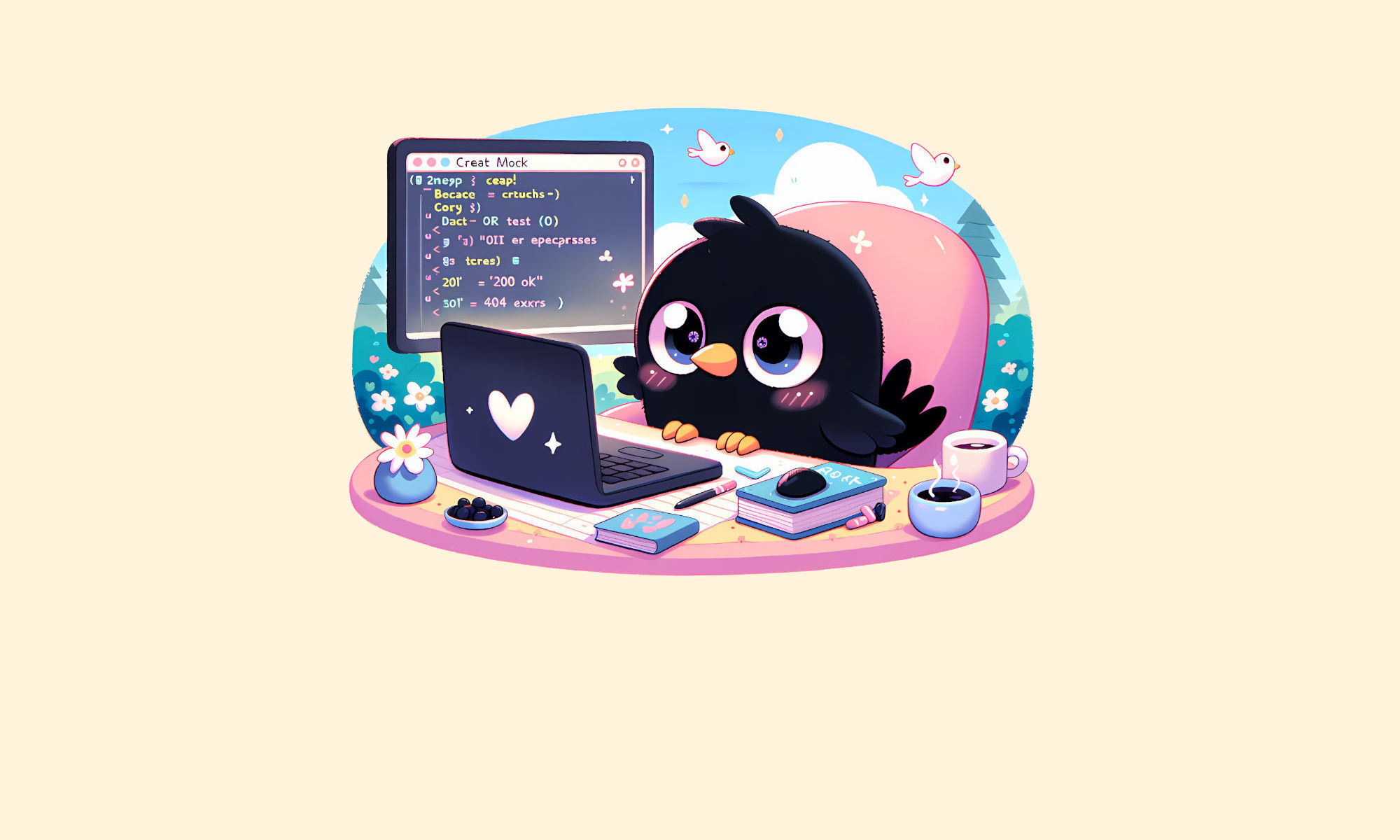
Since I got the new kawaii (Japanese for lovely, cute, and adorable):

I needed to update my old tiled background:

Into a kawaii one, so I started with something pretty and detailed, but had to make it less detailed and eye catchy, to not steal attention from the text and other content:
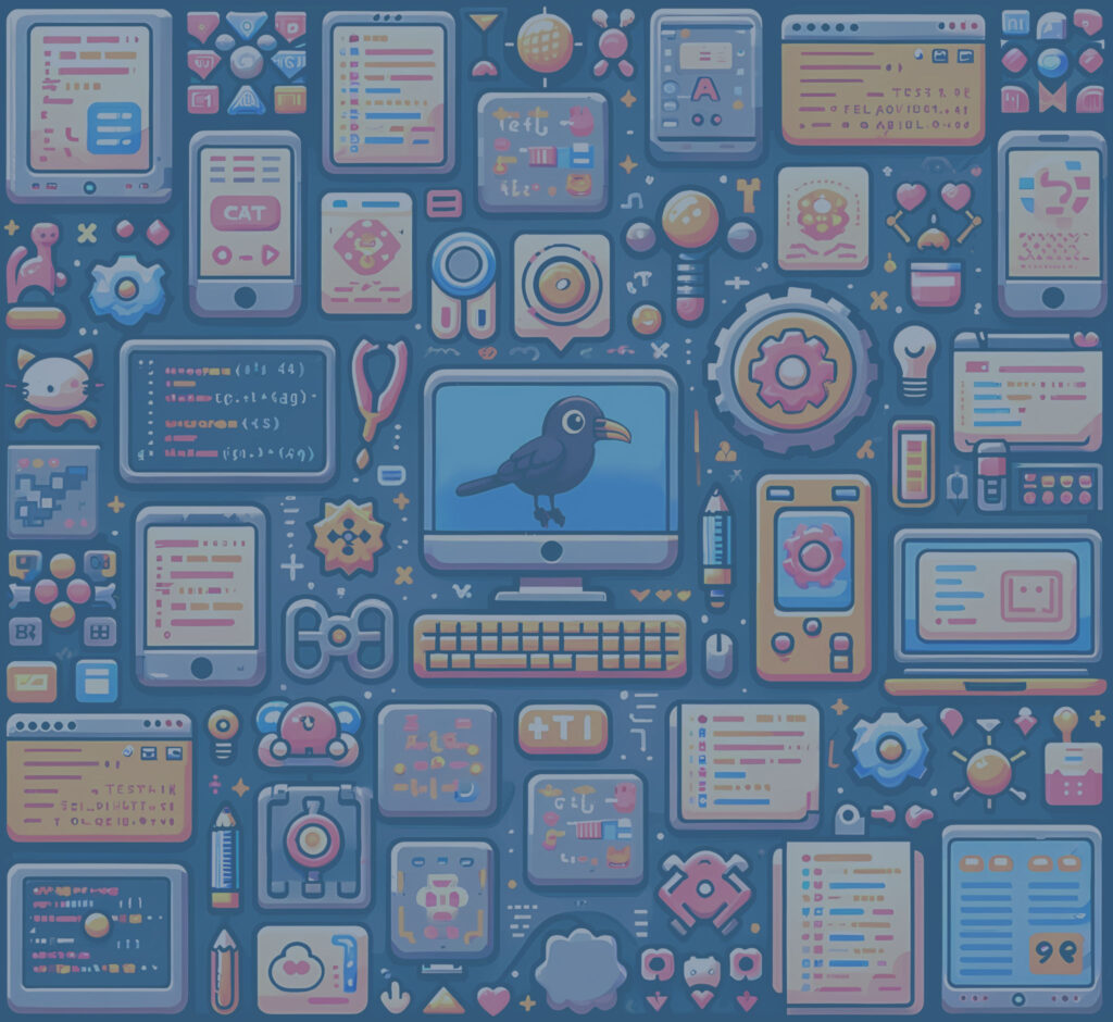
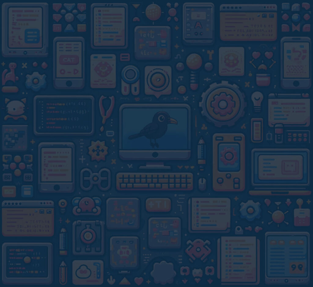


It works well with content, while the prettiest one took too much attention.

Here is an example, that when we test something, we need to test it in the correct context.
Because in a different context, we might select the wrong solution.